The Mixed Cup project was an ambitious venture aimed at conceptualizing and crafting a compelling brand identity for an international carpet court tennis tournament, where both men and women compete collaboratively on mixed teams. The overarching theme sought to challenge traditional gender norms in tennis, highlighting the unity shared among players and nations in this groundbreaking mixed-gender competition.
The logo, a key visual element, intricately portrayed this theme through the symbolic use of intertwining ribbons. These ribbons, distinguished by colors representing each gender, players, and participating countries, creatively converged to form a trophy. This artistic representation vividly captured the dynamic movement and energy inherent in tennis, while also emphasizing the inclusivity and shared achievements of the tournament.
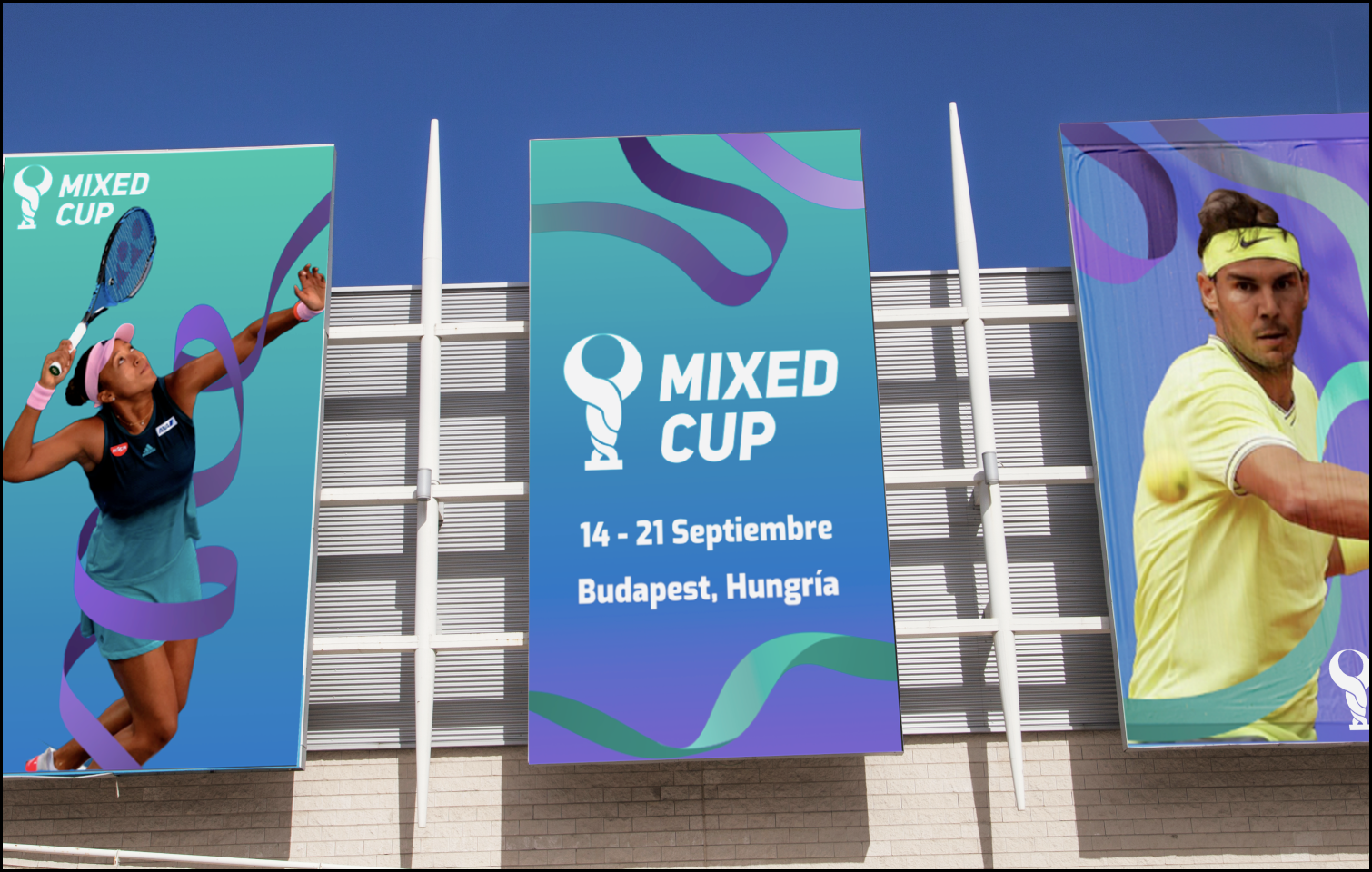
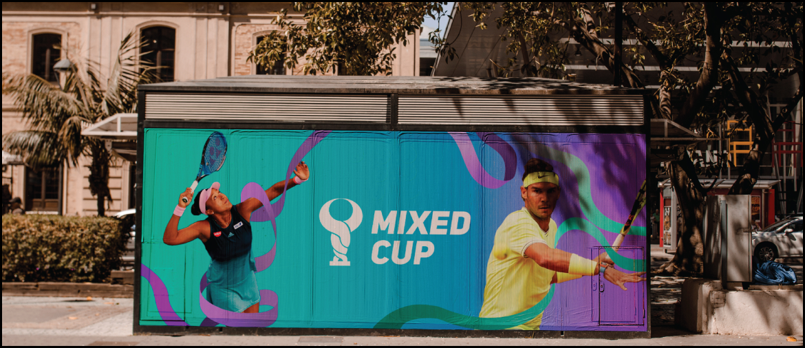
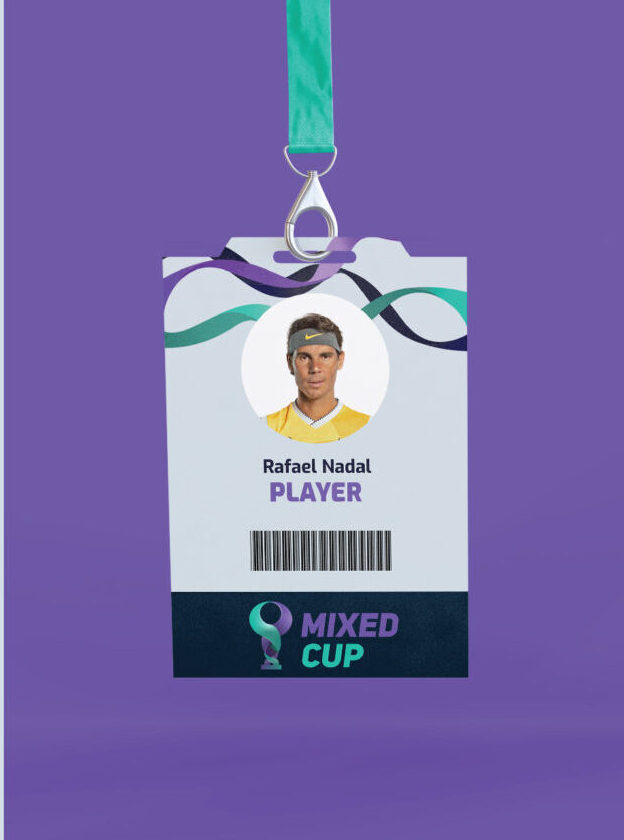
The color palette, carefully chosen with shades of turquoise and purple, played a pivotal role in conveying the desired emotions and values. Turquoise and purple symbolized unity, equality, and cheerfulness, fostering an atmosphere of camaraderie both on and off the court.

More Projects